Drive Safe & Save dashboard redesign
Drive Safe & Save is a telematics and modeling application. It tracts the way you drive and evaluates your driving behaviors to assign a discount amount. In my role, I’m responsible for all things UX for the Drive Safe & Save app which has 6 million users.
What's the problem we're trying to solve? Reduce calls to the call center, while bringing a fresh scalable look to the experience.
State Farm has being trying to redesign the Drive Safe & Save app for 4 years prior to me joining State Farm. I was brought in to make yet another attempt at redesigning it. When it became clear to me that this would be a 3rd attempt, I took sometime to understand what had been done before, what worked, what didn't work. From this knowledge I was able to define a path for the redesign.It was not only important to iterate on great solutions and Strategies, but it would be just as important to get buy-in from key stakeholders.
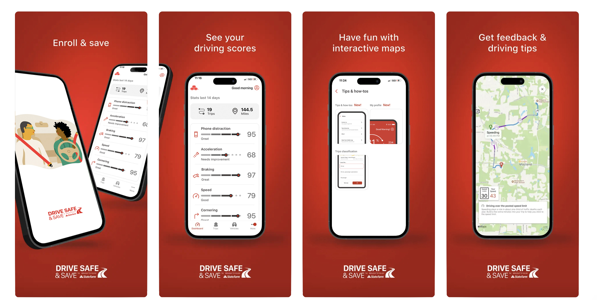
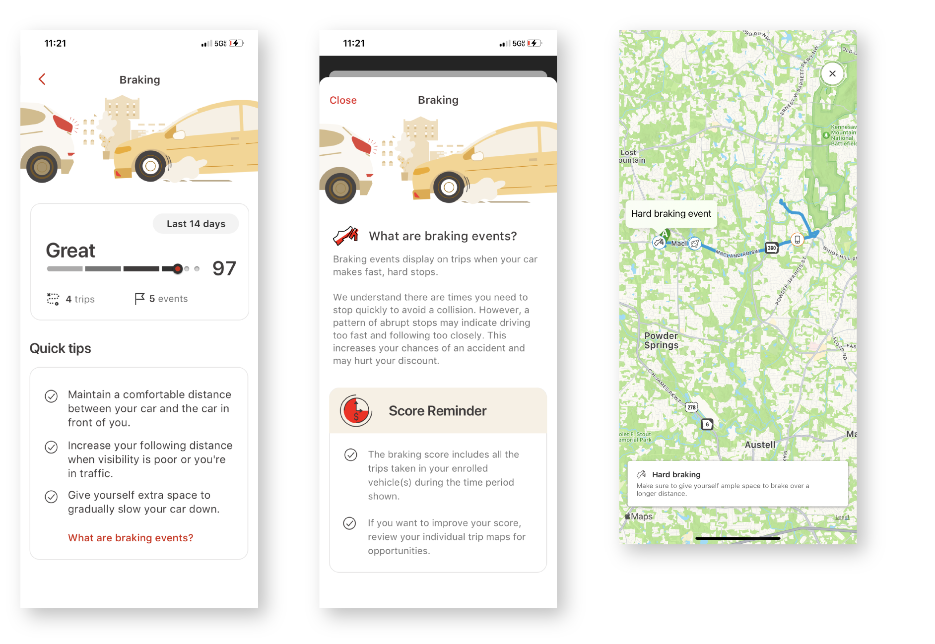
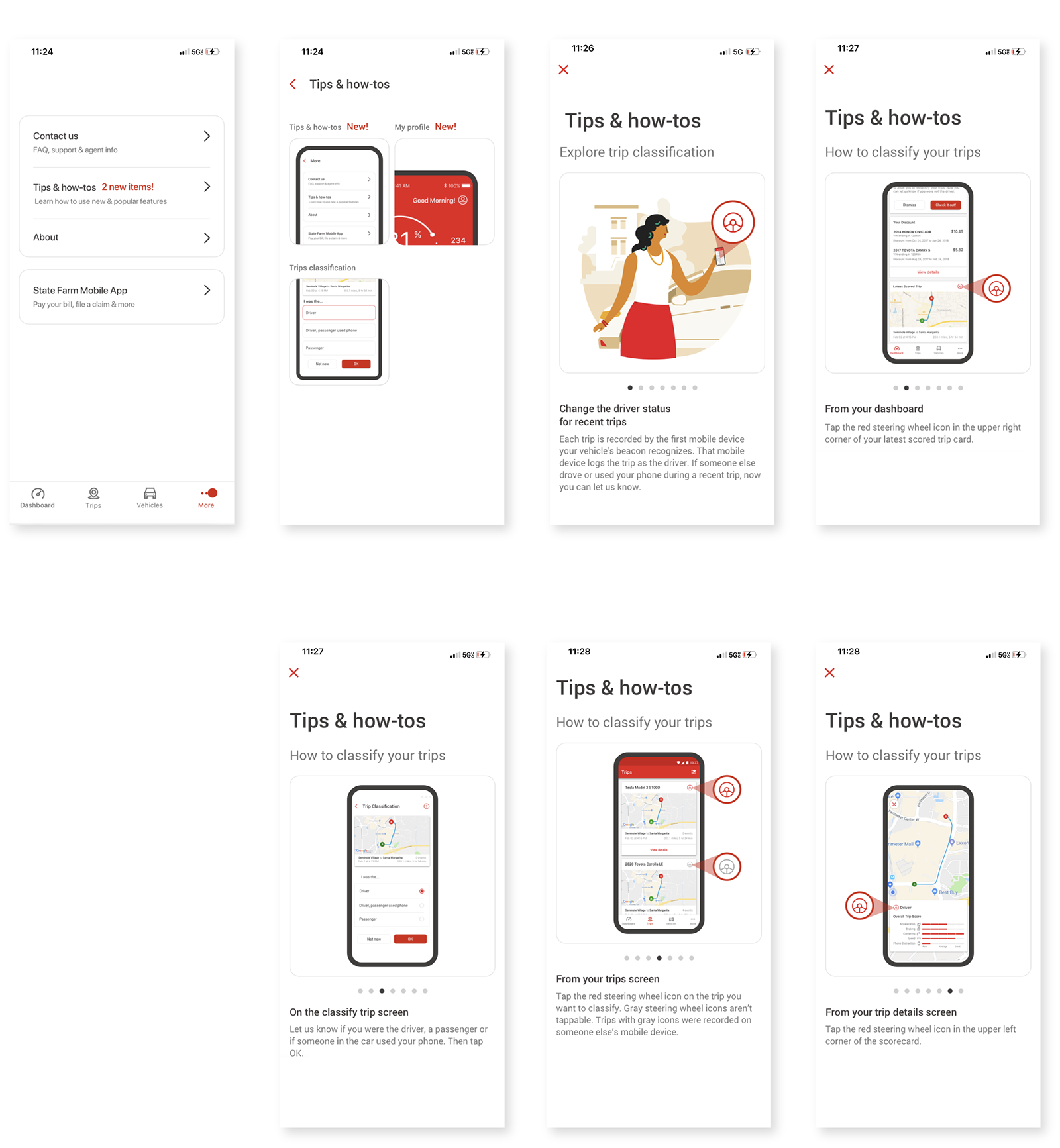
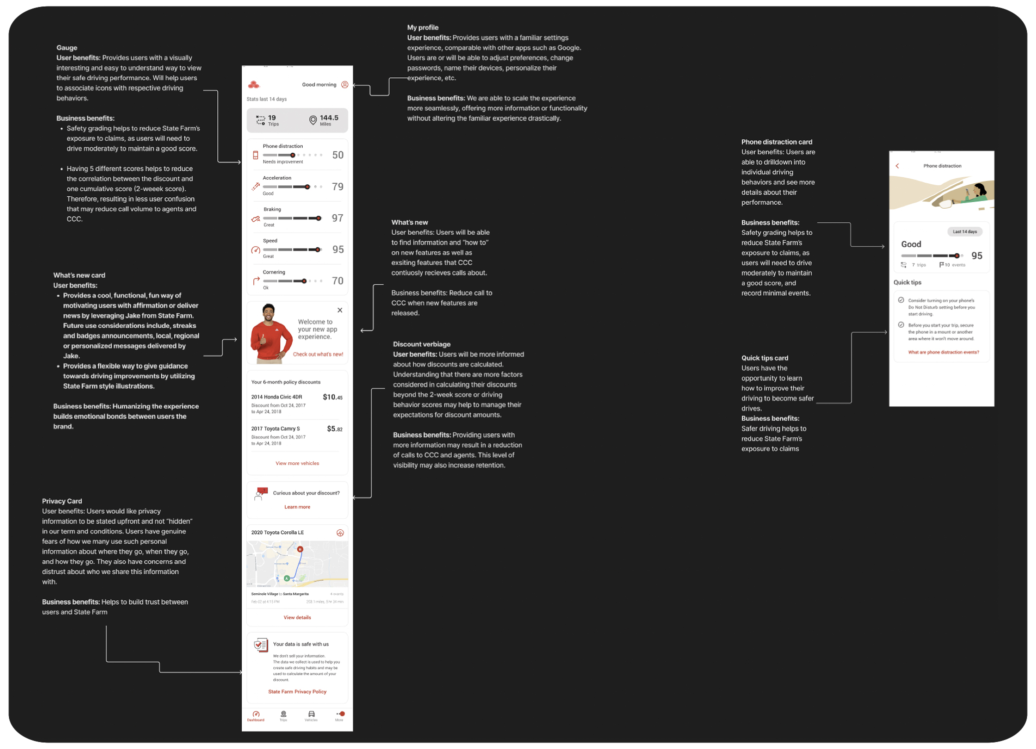
We successfully released the first version of the redesign and received an 85% user approval rating. We implemented a My profile section, deeper insights into driving behaviors, quick insights into privacy concerns, insights into how discounts are calculated, and a Tips & how-tos section. There were five rounds of research done to stress test the experience, gage the usefulness of new features, and content.